
Every order sent to a market moves through the same three-part sequence: a decision made before it is sent, a market that keeps moving while it works, and a record left behind after it fills. Most trading technology optimizes the middle part, the live view of what the market is doing right now, and treats the other two as afterthoughts.
Table of Contents
- Before Execution
- While the Market Moves
- After the Event
- The Five-Question Self-Diagnostic
- Conclusion
- References
A live order book is a display. It answers what the market is doing right now. It does not, on its own, answer what an order should cost, where liquidity is actually concentrated across venues, whether a book will absorb size or crack, or whether a fill from sixty seconds ago was good. Each of those questions has a body of market microstructure research behind it, much of it decades old, that answers it more precisely than a screen ever could.
VisualHFT is used throughout as the working instrument: the figures are its live panels. (Disclosure: VisualHFT is my own project. Its core is open source; the panels showcased in this piece belong to the commercial version built on top of that core.) It connects to seven crypto venues (Binance, Bitstamp, Coinbase, Bitfinex, Kraken, Gemini, and KuCoin) at Level 2 and processes every update each venue publishes, tick by tick, without client-side time aggregation, sampling, or throttling. What follows walks through ten measurable outcomes across that before, during, and after sequence: the mechanism behind each one, how to read the panel that shows it, and the decision it changes.
The starting point is the full-depth view itself: a ladder showing every price level with its size on each side, a cumulative depth chart plotting bid and ask volume outward from the mid, a time-and-sales tape of executed trades, a strip of metric tiles (order book imbalance, market resilience, order-to-trade ratio, and order-flow toxicity, each covered below), a provider-status row showing each connected venue’s live state, and a millisecond-level selector for how finely updates are grouped on screen, a display choice only; the feed underneath is untouched by it.
The metric tiles along the top are where the rest of this piece begins: order book imbalance, resilience, order-to-trade ratio, and toxicity, each explained on its own below.
Before Execution
Thank you for reading this post, don't forget to subscribe!
Three questions decide whether an order is well-designed before it ever reaches the book.
Pre-trade cost. Perold’s 1988 decomposition, which Bessembinder (2003) calls “the ideal measure of trading costs,” splits execution cost into four concrete pieces: delay cost, the price drift between deciding and submitting; explicit cost, commissions and fees; market impact, the price move caused by trading itself; and opportunity cost, what the unfilled remainder of an order would have cost or saved, valued at wherever the price moved after it stopped. Almgren and Chriss (2000) showed why impact and opportunity cost fight each other: trading slowly keeps each slice small and impact low, but stretches the order across a longer window of price drift; trading fast does the reverse. Their efficient frontier is the set of schedules where nothing improves without something else worsening, a chosen tradeoff, not a single answer. Impact itself is concave, not linear: Tóth, Lempérière, Deremble, de Lataillade, Kockelkoren, and Bouchaud (2011) traced the square-root law to a breakdown of linear response under thin local liquidity, so the second half of a doubled order costs less than the first. Linear models overprice large orders for that reason while underpricing the damage of trading too fast. Coalition Greenwich’s 2024 survey (103 buy-side traders, Q4 2023) found almost 90 percent of institutional investors use transaction cost analysis (TCA), 85 percent through a third-party provider, a mature post-trade discipline with, in my experience advising desks, almost no pre-trade equivalent.
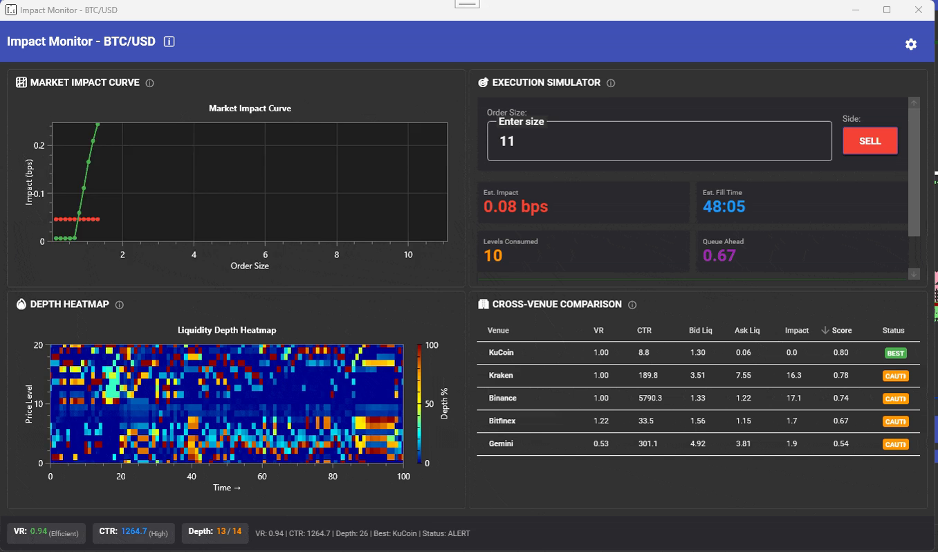
The Impact Monitor’s curve plots estimated impact in basis points against order size, flat at first, then steeply rising, a visual square-root law, with a liquidity depth heatmap beside it mapping depth by price level against time. Entering a size and side into its execution simulator returns estimated impact, expected fill time, book levels consumed, and queue ahead, before any size commits. A cross-venue comparison table scores each venue on volume ratio, cancel-to-trade ratio, bid/ask liquidity, and impact, rolled into a composite score, with the strongest venue for that size flagged. The decision this enables is whether to size, split, or route based on an estimated cost curve, not a guess made after the fact.
The composite score column ranks each connected venue for the entered size; the flagged venue is where that size clears with the least estimated impact.
Liquidity routing. O’Hara and Ye (2011) found that more fragmented stocks carry lower transaction costs and faster execution, but also higher short-term volatility and prices closer to a random walk. Fragmentation is therefore a tradeoff to optimize across for each specific order, rather than a defect to avoid or a reason to rank venues as categorically better or worse. Gould, Porter, Williams, McDonald, Fenn, and Howison’s 2013 survey notes that limit order books match buyers and sellers in more than half of the world’s markets, while many queueing models built to describe them poorly resemble how real books behave, so a routing decision needs live depth, not a theoretical assumption. Concentration itself has a standard measure: the Herfindahl-Hirschman Index, the sum of squared venue shares, where 1.0 means all depth sits at a single venue and lower values mean depth is spread across several.
Liquidity Pools renders that concentration directly: a heatmap of depth by price level against venue, where each cell’s tooltip gives size, share of total, the HHI at that level, and a fragmentation reading. A venue breakdown table checks each venue’s depth against a target trade size, and the footer totals depth, the bid/ask split, per-side HHI, and flags the best venue per side, and the best execution venue for that size. The decision this enables is whether to route the whole size to one venue or split it, based on where concentration and coverage actually sit right now.
A per-side HHI near 1.0 in the footer means one venue holds almost all the visible depth on that side; a lower figure means splitting the order is worth checking.
Thin-book risk. Bouchaud, Farmer, and Lillo (2008) argue that revealed liquidity, the depth actually displayed at any instant, is extremely low relative to what large participants need to trade, because order flow is a highly persistent, long-memory process: today’s buying pressure predicts tomorrow’s, so a large intention gets worked in pieces over periods that can run to months rather than shown all at once. A book that has just absorbed a large piece is therefore statistically more likely, not less, to face renewed pressure soon after, because the underlying flow has not necessarily finished. Displayed depth is a thin slice of a much larger, slower-moving intention, which is why a book that looks adequate at the top can still hide a cliff a few levels down.
Liquidity Gaps boxes the book’s detected gaps and flags cliffs directly on the bid and ask ladders, alongside a Liquidity Gap Ratio dial per side showing its gap count, an asymmetry index, and a depth-to-first-gap reading, both the size at that price and its percentage distance from the top. Gaps are classed by persistence, transient under a second, short-term one to ten seconds, persistent ten to sixty, long-term beyond that, plotted on a heatmap over time and price, with an alert strip surfacing each gap’s severity and persistence class. The decision this enables is whether an intended size is safe against the book’s actual structure, not its displayed top-of-book spread.
A gap classed persistent, ten to sixty seconds, sitting just below the top three price levels is the one worth checking before an order of any real size goes in.
While the Market Moves
Four outcomes describe what a desk needs to observe once an order is working and the market keeps moving under it.
Cross-venue fragmentation. Makarov and Schoar (2020) documented large, recurrent cross-exchange arbitrage opportunities in crypto that, in their words, “often persist for weeks,” not seconds. A common signed-volume factor, correlated buying or selling pressure across venues, explains up to 85 percent of Bitcoin return variation, while the remaining idiosyncratic, venue-specific component is what actually drives the size of any given arbitrage spread, and is exactly what needs continuous tracking to separate a normal, recurring gap from a venue-specific problem worth acting on. The October 10-11, 2025 liquidation cascade shows how extreme that gap can get: more than nineteen billion dollars in leveraged positions were liquidated over the weekend, and USDe traded in the mid sixty-cent range on Binance, roughly a 35 percent discount to its peg, while holding near a dollar elsewhere, because margin engines priced collateral off venue-local spot; top-of-book depth in Bitcoin fell more than 90 percent intraday on some venues in the same event, per FTI Consulting.
The Arbitrage Monitor’s venue-by-venue matrix heatmaps live spreads, and an opportunities table logs buy venue, sell venue, spread percentage, duration, and maximum, active or closed. Most of what fills that table are small spreads opening and closing within milliseconds to seconds, the routine background against which the persistent, week-long dislocations Makarov and Schoar document actually stand out. The decision this enables is whether a live gap is routine background noise or a genuine, actionable dislocation.
Most rows close within seconds; a row still open after several minutes is the one that has stopped being routine.
Feed health. There is little peer-reviewed literature specific to venue feed-quality monitoring; this is closer to an engineering reliability discipline borrowed from software systems than to a market microstructure research question, and it deserves to be described honestly as such rather than dressed up with a citation that does not fit. What is well understood from direct operating experience is that every measurement in this piece, cost, routing, toxicity, inherits the health of the raw feed underneath it, and degraded data reaching a decision undetected is worse than no data at all.
Data Feeds Monitoring cards each connected feed against its own baseline: a current messages-per-second sparkline, average and peak rates, order-book message rate against trade rate, and counters for errors, reconnects, bursts, and gaps, rolled into a per-feed health status. Baselines differ by venue, from single digits to hundreds of messages per second, so a healthy reading on one feed can be an alarming drop on another; the comparison that matters is a feed against itself. The decision this enables is whether to trust, throttle, or fail over a feed before its degradation reaches a live decision.
Watch deviation from a feed’s own average, not the raw messages-per-second number: a feed idling at half its usual pace is worth a second look, even if that average is only a handful of messages per second.
Order-flow toxicity. Easley, López de Prado, and O’Hara (2012) define order flow as toxic “when it adversely selects market makers,” and describe VPIN, their volume-synchronized measure, as “a useful indicator of short-term, toxicity-induced volatility.” The mechanism runs on a volume clock rather than a time clock: buckets fill as a fixed amount of volume trades, each trade within a bucket classified buy or sell, and the imbalance between the two sides across recent buckets is the metric. Because the clock is volume, not time, a toxic episode compresses many buckets into minutes, sometimes less, where a calm market would spread that same volume across hours, which is why VPIN can spike quickly ahead of stress. The Office of Financial Research’s 2014 working paper found that high-fidelity book data can define stability indicators that reliably signal a high likelihood of an imminent flash-crash event roughly one minute before it occurs, a figure specific to the data studied, not a universal constant, but the generalizable finding is that instability leaves a measurable signature before it becomes a price move.
The VPIN view updates the metric live on that same volume clock; readings pushing toward the top of its scale flag flow that is one-sided rather than balanced. The decision this enables is whether current flow warrants wider quotes, reduced size, or a pause, before adverse selection shows up in realized fills.
Toxicity often shows up here before price does: a reading pushing toward the top of the scale while price action still looks unremarkable is the earlier signal.
Market recovery. Obizhaeva and Wang (2013) modeled resilience as a recovery-rate parameter, how fast supply and demand return to a steady state after a trade disturbs them, and showed the optimal execution strategy depends on that rate, not on the static spread or depth visible at any single instant. A book with identical displayed spread and depth to another can be a materially worse place to trade if it recovers slowly, and resilience is a property of prevailing conditions, not a constant to assume once and reuse; a venue that recovered quickly last month under calm conditions can behave differently in a stress event. Optimal schedules under this model split large orders into slices timed to let the book refill between them. A separate empirical study (arXiv:1602.00731) gives a concrete clock for what “recovered” means: after an aggressive order, spread and depth can return to their sample average within twenty best-limit updates, a definition a desk can implement directly against its own feed.
The Market Resilience view scores each book from zero to one, updating as it recovers after trades, a direct read of the same recovery rate the model describes. The decision this enables is whether a book is resilient enough to re-enter shortly after impact, or still absorbing and best avoided.
A score still climbing back toward one several seconds after a large trade marks a book that has not finished absorbing it.
After the Event
Three outcomes describe what should exist once the event, whatever it was, is over.
Incident capture. The May 6, 2010 Flash Crash is the reference case for how long cross-venue reconstruction takes when nobody owned the capture in advance. The SEC and CFTC’s preliminary findings were published May 18, 2010, twelve days after the event; the full joint findings were not published until September 30, 2010, roughly four and a half months after a crash that played out in minutes. A regulator reconstructing a market-wide event has to gather data across every participant after the fact, most of why the timeline runs to months. A single desk reconstructing its own book only has to preserve what it already has access to, if it decided in advance to keep it.
The Event Capture Recorder keeps a rolling ring buffer per stream, gigabytes deep, against a checklist of armed trigger rules. A capture history logs each firing: which rule fired, the symbol, the pre and post window it preserved, thirty seconds before and five after is typical, the size and frame count captured, each entry directly replayable. The decision this enables is whether a post-event review has real market state to examine, or has to be reconstructed from memory.
Each row’s pre and post window is what turns “something happened around 2:14” into an exact, replayable thirty-five seconds of book state.
Deterministic replay. Reproducibility is a systems property: pushing the same captured books, trades, and reports back through the same live pipeline should produce the same output every run, which is what makes a replayed session usable as evidence rather than an approximation. Commercial capture-and-replay appliances, Exegy’s Capture Replay among them, already exist specifically for Reg NMS best-execution documentation, so the category itself is established; the open question for most desks is whether replay connects to the other measurements in this piece or sits isolated in a specialist appliance nobody consults until something has already gone wrong.
The Replay Engine loads a captured file and steps through it with a replay-active, realtime-muted interlock so the two modes cannot be confused, a start, current, and end clock at millisecond precision, requested versus actual playback speed, and timestamped bookmarks. The file loaded in the frame shown is a NASDAQ TotalView ITCH capture, worth stating plainly: the capture and replay layer consumes recorded feed captures beyond crypto, even though the live connectors today are crypto Level 2. The decision this enables is whether a disputed fill or alert can be examined exactly as it happened, on demand.
The requested-versus-actual speed readout is the tell that a replay is running deterministically rather than just fast-forwarding through approximated ticks.
Execution diagnostics. Bessembinder’s 2003 review is explicit that execution-cost measurement is methodology-sensitive: the same fill produces different cost estimates depending on the benchmark chosen, arrival price, VWAP, an interval average, each a different reference point for the same trade, part of why he treats Perold’s implementation shortfall as the reference standard rather than any single proprietary metric. That sensitivity has a real consequence: the FIX Trading Community formed a dedicated TCA working group in February 2014 specifically because, in the group’s own words, the industry suffered from “multiple methodologies and terminologies… resulting in a lack of transparency.” Coalition Greenwich’s 2024 survey found 85 percent of institutional TCA users rely on a third-party provider for that measurement, meaning most desks are trusting someone else’s methodology choice without necessarily seeing it.
The Diagnostic Report exports an execution-window table at each milestone, average, median, ninety-fifth percentile, favorable versus adverse readings, and the delta between them, for VPIN, order book imbalance, and resilience, alongside a time series overlaying spread, mid-price, cancellations, buy and sell fills, and rejections, plus a latency and operational health section. The window shown in the frame is an FX pair, evidence the diagnostic layer is not specific to one asset class. The decision this enables is whether a fill, venue, or routing choice should change, based on outcome tied to the market conditions actually prevailing at the time.
The delta column between favorable and adverse readings at the same milestone is what separates a genuinely tight execution from one that just got lucky on timing.
The Five-Question Self-Diagnostic
Ten outcomes are a lot to hold at once. Five questions compress them into something you can run against an actual fill today.
- Pre-trade cost. For any fill in the last thirty days, can you produce the cost estimate that existed before the order was sent, and the realized cost afterward, broken into Perold’s four buckets (delay, explicit, market impact, opportunity cost), so the two numbers are directly comparable?
- Routing evidence. Can you show the specific inputs your routing logic saw, at the exact timestamp it decided, for why an order went to venue A and not venue B?
- Deterministic replay. Can you replay, exactly, the ninety seconds of market state before any anomalous fill or system alert, the actual book, not a log line summarizing what someone believes happened?
- Disagreement with the venue. If your price disagreed with a venue’s price during a stress event, a depeg, a halt, an outage, do you have a timestamped, recorded basis for your own number, or only the venue’s word for it?
- One clock or four. Is this one evidentiary system on one clock, or four vendor relationships, a cost model, a routing log, a capture appliance, a TCA report, that have never been reconciled against each other?
Conclusion
Run the five questions above against the five fills your desk is proudest of from the last quarter, the ones a portfolio manager would point to as proof the execution stack is working. In my experience advising trading desks, most produce a confident answer to one of the five, usually the one easiest to reconstruct after the fact. Very few produce all five, on demand, for a fill more than a week old. That gap, not the dashboard in front of you, is the real state of your execution measurement. Whoever closes it, in-house or through a vendor, ends up owning the thing counterparties and your own risk committee will eventually ask to see.
References
- Perold, A. F. (1988). The implementation shortfall decomposition, cited via Bessembinder (2003) below.
- Bessembinder, H. (2003). Issues in Assessing Trade Execution Costs. Journal of Financial Markets, 6.
- Almgren, R., & Chriss, N. (2000). Optimal Execution of Portfolio Transactions. Journal of Risk.
- Tóth, B., Lempérière, Y., Deremble, C., de Lataillade, J., Kockelkoren, J., & Bouchaud, J.-P. (2011). Anomalous Price Impact and the Critical Nature of Liquidity in Financial Markets. Physical Review X.
- O’Hara, M., & Ye, M. (2011). Is Market Fragmentation Harming Market Quality? Journal of Financial Economics, 100.
- Gould, M. D., Porter, M. A., Williams, S., McDonald, M., Fenn, D. J., & Howison, S. D. (2013). Limit Order Books. Quantitative Finance.
- Bouchaud, J.-P., Farmer, J. D., & Lillo, F. (2008). How Markets Slowly Digest Changes in Supply and Demand.
- Makarov, I., & Schoar, A. (2020). Trading and Arbitrage in Cryptocurrency Markets. Journal of Financial Economics, 135.
- Easley, D., López de Prado, M. M., & O’Hara, M. (2012). Flow Toxicity and Liquidity in a High-Frequency World. Review of Financial Studies, 25.
- Obizhaeva, A. A., & Wang, J. (2013). Optimal Trading Strategy and Supply/Demand Dynamics. Journal of Financial Markets, 16.
- Order book recovery after aggressive orders (2016). arXiv:1602.00731.
- Paddrik, M., Hayes, R., Scherer, W., & Beling, P. (2014). Effects of Limit Order Book Information Level on Market Stability Metrics. Office of Financial Research Working Paper 14-09.
- SEC & CFTC (2010). Findings Regarding the Market Events of May 6, 2010.
- Coalition Greenwich (2024). Equities TCA 2024: Analyze This, a Buy-Side View. Q4 2023 survey, 103 buy-side traders.
- FIX Trading Community TCA Working Group (2014). TCA Standardization Guidelines.
- Exegy. Capture Replay (product documentation, Reg NMS best-execution use case).
- FTI Consulting (2025). Analysis of the October 10-11, 2025 crypto liquidation cascade.
Never Miss an Update
Get notified when we publish new analysis on HFT, market microstructure, and electronic trading infrastructure. No spam.
Subscribe by EmailAriel Silahian is a senior technology executive in institutional electronic trading, with 30+ years across the buy and sell side (New York, Miami, London, Hong Kong). He is the author of "C++ High Performance for Financial Systems" (Packt) and the creator of VisualHFT, the open-source microstructure analytics stack. He writes on exchange architecture, market microstructure, and execution quality, and advises a select number of trading firms on infrastructure decisions that move P&L. Book a strategy call at hftAdvisory.com